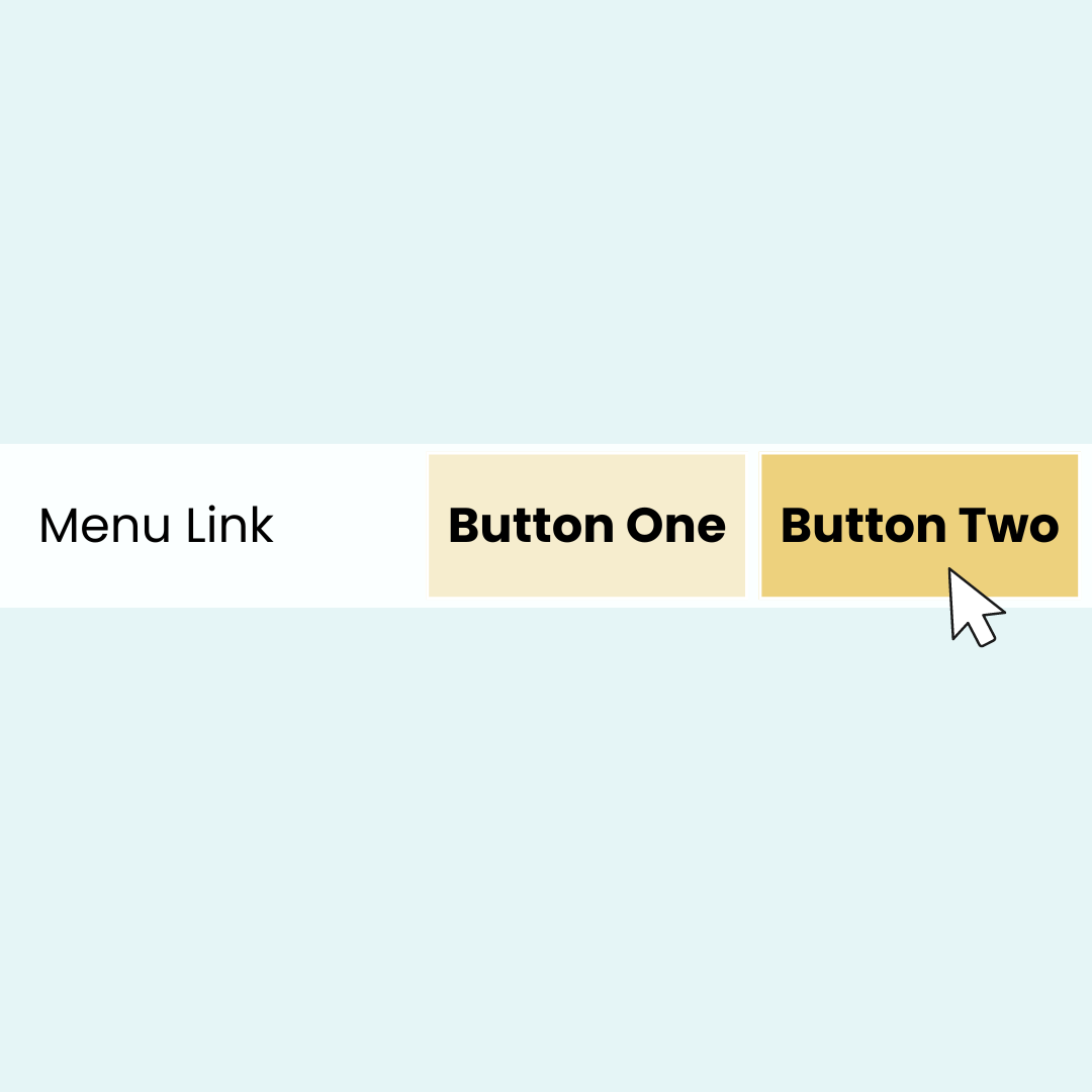
How to add a second button to your Squarespace menu
Ever wished you could squeeze just one more button into your site's main menu? Well, you're in luck!
In this tutorial, we're going to unlock a little-known Squarespace superpower: adding a second button to your navigation using some nifty custom CSS.
Now, before you start thinking, "CSS? That sounds complicated!" – take a deep breath. I promise to break it down into bite-sized, easy-to-follow steps that even CSS newbies can handle. We'll start with the basics of pasting our magic code, and then I'll show you how to customize it to match your site's unique style. Want to change colors? Adjust padding? Add a cool hover effect? We've got you covered!
The best part? This hack works for both your desktop and mobile menus, so your site will look sleek and professional on every device. I've dropped the custom codes below for you to use, but make sure to watch the full video tutorial. Trust me, you'll want to see exactly how to tailor these codes to your specific Squarespace site.
Important update: Squarespace made changes to the program menu in May 2025. If your menu looks different than the video, press the / key to open the program search and search for Custom CSS to navigate there directly.
Here is the main code from this tutorial. I want to encourage you to get creative here; try adding a border, maybe a gradient background, or curve the corner with a border radius! Your only design limit is your imagination ✨
.header-nav-item:last-of-type:not(.user-accounts-text-link),
 .header-menu-nav-item:last-of-type:not(.customerAccountLoginMobile) a{
  background:red;
  padding: 5px;
  margin-top: -5px
}
.header-nav-item:last-of-type:not(.user-accounts-text-link):hover{
background: pink
}
