How to customize Squarespace contact form fields
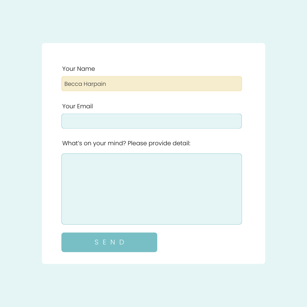
Squarespace forms are incredibly useful, but their default appearance might not always align with your site's unique aesthetic. That's where CSS comes in. With a few lines of code, you can transform your forms to match your brand perfectly.
This tutorial will teach you how to:
Modify input field styles, including borders, backgrounds, and text
Adjust button appearances to complement your design
Create hover and focus effects for enhanced user interaction
Whether you're a CSS novice or an experienced coder, this tutorial will provide you with the tools and knowledge to elevate your Squarespace forms. We'll walk through each step, explaining the code and its effects, so you can understand not just what to do, but why you're doing it.
For step by step isntructions on how to customize with code, check out the video. The codes are below, and long with additional resources that can help you customize your site.
Important update: Squarespace made changes to the program menu in May 2025. If your menu looks different than the video, press the / key to open the program search and search for Custom CSS to navigate there directly.
Here are the codes used in this tutorial.
Be sure to edit the values so they match the style of your own website!
/* Change the input field border & background */
.sqs-block-form .field-list .field input,
.field textarea {
border: 1px solid #eee;
border-radius: 5px;
background: #e5f5f6;
}

/* Change the focus style */
.sqs-block-form .field-list .field input:focus,
.field textarea:focus{
background: #F6EDCE;
outline: none!important
}

/* Change (required) to an asterisk */
.sqs-block-form span.required{
visibility:hidden
}
.sqs-block-form span.required:before{
content:" * ";
visibility:visible!important
}

/* Change the submit button colors */
.form-wrapper input[type=submit]{
background-color: #A1D9DD!important
}
.form-wrapper input[type=submit]:hover{
background-color: #EDD17D!important
}
New File Upload Feature
Squarespace forms now have a file upload option! Learn how to use this new feature, and how to customize it in this tutorial.

