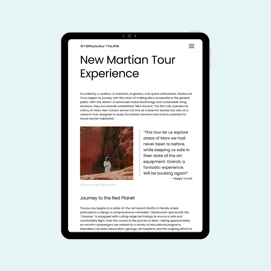
How to customize blog post width on tablet screens
You've probably noticed that sometimes your carefully crafted content doesn't quite hit the mark on tablet devices. There is good news - I've got a simple solution that's going to change your blogging game!
In this tutorial, I'll walk you through a quick and easy CSS trick to customize your blog post width specifically for tablets. Don't worry if you're not a coding pro just yet - I'll break it down step by step.
The code is below the video, but please make sure you watch it so you understand how to add this code to your site and how to change it to make it uniquely yours.
Important update: Squarespace made changes to the program menu in May 2025. If your menu looks different than the video, press the / key to open the program search and search for Custom CSS to navigate there directly.
@media only screen and (min-width: 768px) and (max-width:1024px){.blog-item-inner-wrapper{
  margin: 15vw!important;
  width: 70%!important
}
}
