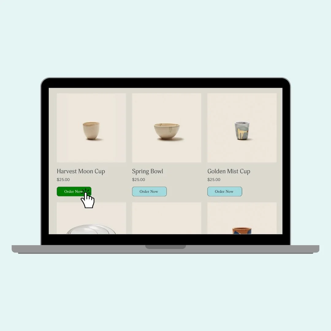
How to Customize the Add to Cart Button in Squarespace
In this tutorial, you’ll learn how to completely customize the Add to Cart button across your Squarespace site, from the product list to the detail page to product blocks.
Below you'll find code examples you can copy and paste, along with quick explanations and optional customizations. Use what works best for your design style, and don’t forget to hit Save after you test each one out!
📍 Important Reminder Before You Begin:
Squarespace offers three distinct types of Add to Cart buttons, each identified by a unique selector:
Product List (you store)
.product-list .sqs-add-to-cart-buttonProduct Detail Page (individual product page)
.product-detail .sqs-add-to-cart-buttonProduct Block (content block)
.product-block .sqs-add-to-cart-button
You’ll want to target them separately if you want to give each one a unique look—or combine the selectors if you want the same style applied site-wide.
🎨 Change the Background Color
Let’s start with something simple: changing the button color. This will give your Add to Cart button a bold red background (you can swap in your brand color here).
Pro Tip: If your text becomes hard to read, don’t forget to update the font color, too:
.product-list .sqs-add-to-cart-button {
  background: red!important;
  color: #ffffff!important
}
🟦 Adjust the Shape of the Button
Want a pill shape or soft rounded edges? Use border-radius to adjust the button’s shape. You can also use a smaller value like 10px for subtle rounded edges.
.product-list .sqs-add-to-cart-button {
  border-radius: 50px;
}
📏 Adjust Button Size and Alignment
Want your button a little smaller or centered differently? Try this combo - this makes the button half the container width and centers it visually with margin-left.
.product-list .sqs-add-to-cart-button {
  padding: 10px;
  width: 50%;
  margin-left: 25%;
}
🖱 Add a Hover Effect
Adding a hover effect gives your site a more dynamic feel—and encourages clicks! Try this code to change the background color when someone hovers over the Add to Cart button. This will turn the button green on hover and switch the font color to white.
.product-list .sqs-add-to-cart-button:hover {
  background-color: #00a86b!important;
  color: #ffffff!important;
}
✏️ Change the Button Text (Like “Order Now”)
If you want to switch it up and have your Add to Cart button say something else—like “Order Now” or “Get It!”—you can hide the original text and insert your own. This works by hiding the default label (with font-size: 0) and displaying your custom message using ::before.
Pro Tip: You can use this method on any of the selectors—just be sure to change .product-detail to .product-list or .product-block depending on where you want the new text to appear.
.product-detail .sqs-add-to-cart-button .sqs-add-to-cart-button-text {
  font-size: 0;
}

.product-detail .sqs-add-to-cart-button .sqs-add-to-cart-button-text::before {
  content: "Order Now";
  font-size: 16px;
  display: inline-block;
}
Here is the full code from the tutorial combining many of the techniques above:
/* Full code with from the tutorial */
/* product list button */
.product-list .sqs-add-to-cart-button {
  background:#a1d9dd!important;
  color:#333!important;
  border-radius:10px;
  border:1px solid #333!important;
  padding:10px!important;
  width:50%!important;
  margin-left:25%!important;
}
/* product list button - hover effect */
.product-list .sqs-add-to-cart-button:hover {
  background:green!important;
  opacity:1!important;
  color:#fff!important
}
/* product page button */
.product-detail .sqs-add-to-cart-button {
  background:blue!important
}
/* product block button */
.product-block .sqs-add-to-cart-button {
  background:yellow!important;
  color:#000!important;
}
/* hides original text */
.product-detail .add-to-cart-text {
  font-size: 0;
}
/* displays new text */
.product-detail .add-to-cart-text:before {
  content: "Order Now";
  font-size: 1rem
}
Pro Tip: 📱 Don’t forget to double-check your design on mobile! Most of these styles will carry over perfectly, but it’s always smart to preview the layout on smaller screens.
